First up - apologies! This post has no technical content whatsoever about compilers, programming languages or Delphi. It's just a rant: I want to document my Vista annoyances so that I can hopefully move on. You know, denial, acceptance, and all that. Maybe I'll even look back on this post a few years from now and see where I was wrong!
Shell
Almost all my annoyances about Vista come from the Explorer shell. I've reached the point where I am somewhat seriously considering writing my own shell that supports the bare minimum, but the fact that file dialogs would be beyond my reach without some fairly hardcore system DLL replacement holds me back. For now.
Non-configurable Explorer Toolbar
The toolbar is no longer configurable, and in particular, it is no longer possible to move all three components - menu, tool buttons and location - onto a single row to maximize client area. Here's what I mean: my default Explorer setup has a height, from top of window to start of listview client area, of 65 pixels:

The equivalent in Vista has a height of 125 pixels, i.e. wasting over 90% more screen space for no benefit:

And yes, I run Vista without any themes, for a number of reasons: I'm not impressed, the compositing uses resources I'd rather spend on other things, and I often interact with Vista using RDP and I'd rather not have to deal with two different UI styles. And yes, I want that menu bar: it has useful commands like, you know, map network drive.
Missing XP-style Start Menu
This is the next biggest issue. If they had put in an option to have an XP-style menu combined with the new search box, a good deal of grief would have been forgiven. As it is, I detest the new start menu. The only backward-compatible option is a Windows 95 option, which is bizarre from my point of view - XP has been Microsoft's longest selling OS, and it's the immediate predecessor to their new version, and the backward compatible option they offer is for an obsolete style that's over 10 years old? It makes no sense to me.
Here are some of the niggles with the new menu that annoy me so much.
Constant clicking
With XP, the fact that a menu expanded when hovered over meant that muscle memory could be used for navigation. I've used TweakUI to reduce this hover time so that it's just long enough that mouse navigation doesn't cause redundant sub-menu opening. On Vista, I have to click and scroll around to find things. I'm almost in the same situation as if I had to browse through the shortcuts in the file system directly with Explorer.
Constrained tiny little box
With the XP menu, I have the entire height of the screen in which to show a submenu. Since I keep my top-level submenus strictly categorized, with headers like Development, Tools, CodeGear etc. for direct access to application shortcuts, and a catch-all group called Groups which contains all those start-menu folders that application vendors add, I have very dense menus with an efficient navigation experience, a lot like the Control Panel menu (more on that next). Not so on Vista. Everything is crammed into a tiny little box, complete with wee little scrollbars, even while I have a relatively vast expanse of 24" monitor begging to be used.
Missing GUI Navigation in Control Panel
I mostly use the Control Panel menu from the Start Menu to access control panel applets, because (as a developer) I'm always tweaking this or that setting.
Unfortunately, Microsoft have added more hierarchy to the control panel (not a problem, in my view, because there are more options in Vista), but have provided less means of navigating it! Here are some concrete examples.
No submenus in Control Panel menu from Start Menu
Look at the XP Control Panel menu:

Now take a look at the Vista Control Panel menu:

Spot the differences? The XP menu provides direct access to printers, network adapters and scheduled tasks, etc.; whereas the Vista menu has hidden those things away inside the applets themselves.
Now, the Vista equivalent of Scheduled Tasks is a lot more capable, but it's also a lot more complicated, seems to expose some innards of the Windows system such that it's easier to break, and has a dog-slow UI with three - I counted them, three - nested client areas in the center panel. I'm not convinced that the old shell view extension mechanism wasn't better.
Inconsistent Explorer / Control Panel navigation
It's a similar story for network adapters. I occasionally have need to change IP or other settings for various reasons. For example, all my desktop machines have multiple ethernet adapters and I ocassionally route wireless traffic from a base station in one port and out the other to the broadband router.
Since the Control Panel submenu is no longer available, I have to go through the new "Network and Sharing Center" and try to figure out where the adapter configuration is hidden. Eventually I alight upon "Manage network connections", but this pops up a separate window which appears to be a subfolder of the Control Panel called "Network Connections" - at least, judging by the location bar:

However, try to find this folder either by navigating the control panel or by browsing the control panel's shell namespace tree, and you won't find it. The quickest way to get back to it is by creating a shortcut, but that's not so easy to figure out either, seeing how Microsoft removed the "Favorites" menu. What you need to do is click and drag the small icon in the location bar into some Explorer folder view, like the desktop.
And that brings me to another point. In Vista, you can't explore the Control Panel namespace using Explorer's treeview. In fact, if you start out in an Explorer window that has a treeview visible, and you select the Control Panel child of the Desktop namespace, the treeview disappears. I find this disturbing and disconcerting. It's almost like the feature had bugs, so they had to disable that way of accessing the Control Panel. Even the new context-sensitive Explorer toolbar disappears when the Control Panel is entered, removing with it the ever useful "rotate icon size" (Views) button that looks like a menu, and the Organize menu that looks like a button.
Missing Security tab for multiple selection
Onwards, to more practical every-day matters. I have multiple hard drives (11 3.5" disks at last count, totalling 4.75 ISO-TB, or about 4.3 real TB), installed across three desktop machines. These drives are almost all formatted with NTFS, with a single ext3 disk for Linux. Apart from OS boot drives, most of these drives have no fixed abode; they are liable to be swapped around or accessed from laptops after being installed in enclosures (I have two USB enclosures that can take any one of SATA, 3.5" IDE and 2.5" IDE drives).
If you've done this yourself, you'll know the problem that crops up (and it is somewhat exacerbated by Cygwin): the permissions for files and directories on the disks often embed machine-specific SIDs, meaning that you have to reset permissions to get access. This isn't a totally trivial matter: sometimes, you need one recursive pass to take ownership, and a second pass to replace permissions, if the original permissions were restrictive.
So, resetting permission on a handful of folders using Explorer should be a piece of cake, right? Here's the dialog for three selected folders in XP:
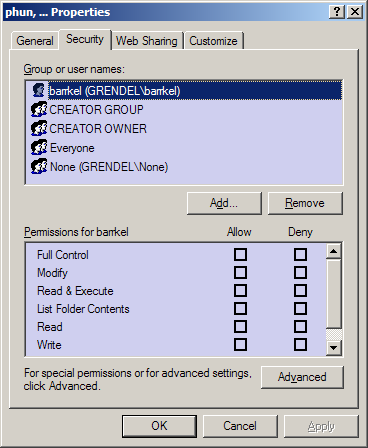
And here it is in Vista:
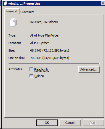
Or rather, here it isn't. I see No Good Reason for this.
Missing menus
It has become fashionable for applications designed for Vista to hide menu bars. Unfortunately, they usually haven't been replaced by a viable alternative. For example, examine the Windows Media Player for Vista:
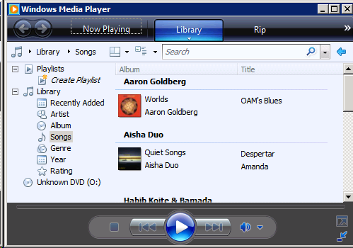
Suppose you have copied the URL of a movie stream from the Internet and want to watch it in full screen etc. in a proper media player, rather than in a tiny plugin window - which by itself often slows down and destabilizes the browser. Now, I know that previous versions of WMP have an 'Open URL' menu item. I know that the Open command is on the File menu, and has been since the days of Windows 3.0 and before.
The only question is - where the heck is the File menu? I'm being deadly serious: I have been in this exact scenario, and I had no idea where to go. It turns out that the menu has been hidden as a context menu on some of the gaps in the toolbars. This is only one of the reasons I use Media Player Classic for almost all video playback.
You know, it's this kind of behaviour - prioritizing asthetics above functionality - that makes me hate Apple. At least Apple are usually more consistent and slightly more usable, if you're willing to accept the concomitant lack of functionality and user freedom, and general vibe of submission to the will of a tyrant. A tyrant (Jobs) with good taste is still a tyrant, and ought be shunned, if you value long-run freedom.
Missing keyboard accelerator hints
And on the topic of menus... where are the keyboard accelerator hints? You know, those little underlines that show which key, in combination with the Alt key, will select that menu item. They were disabled in XP by default too, but were easily re-enabled in Display Properties | Appearance | Effects. The analogous location in Vista has far fewer options.
Inconsistently extended right-click area in detailed listviews
Onwards to the rest of the main Explorer window itself. This bug - I can only call it a bug - catches me every time I work with a large folder in Vista. Observe, a folder with lots of files, and one selected; a common starting point:
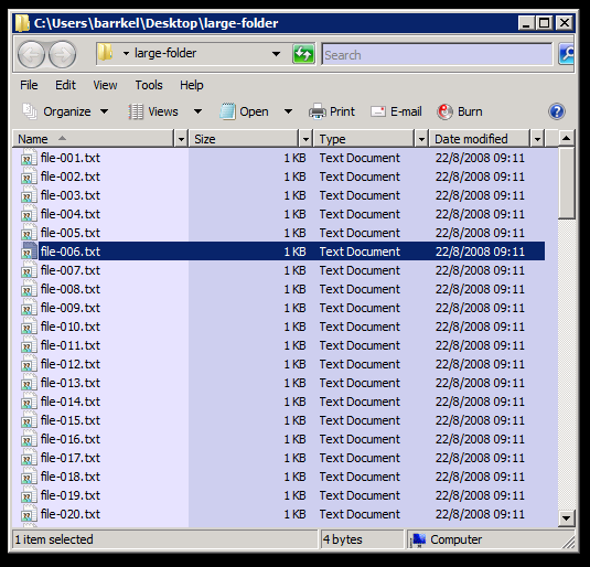
Note the full selection width, which is different from XP, where only the icon and its associated text were marked selected.
Suppose I want to create a new folder. Where should I right-click? In XP, anywhere outside the selection and not directly on an icon or its associated text would do. Let's try that:
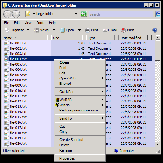
Ha ha! You thought wrong, buddy!
If you've played around with the new selection rules in Vista, you'll know that any text associated with a row in a detailed listview counts as item area. Now, I don't like this new behaviour: I use detailed view all the time, and because I like dense information, there is relatively little free space for folder context operations - most of the columns are filled with text.
It gets worse, though. How do you select multiple items using a drag rectangle in this new paradigm? To do this, you must deliberately leave wasted space to the right of all columns, so that you can begin your drag rectangle there. If you don't, the initial drag operation is interpreted as initiating a file move operation.
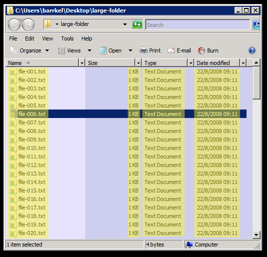
But wait! What about the weird behaviour seen above, where the item context menu pops up even though I'm not clicking on any text? This is a listview bug, and still hasn't been fixed even though Vista has been out for ages now. Let me demonstrate. This is the logical item area, highlighted as best I can in yellow:
And this is the actual item area:
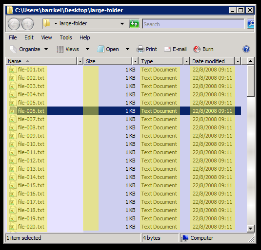
The selection logic doesn't take account of the column alignment. This causes me amazing amounts of frustration, because the biggest chunk of free space for right-click operations for me is between the left-aligned Name column and the right-aligned Size column. There's usually plenty of space here to account for huge files and long names; but there's an invisible item-associated click area right down the middle of it.
Treeview draw gaps
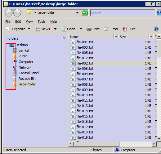
This one is minor, but still annoying. With effects turned off, treeviews that don't have either the focus or the cursor inside their bounds don't draw plus/minus boxes for folders that have children. It just looks plain ugly:
Listview deletes kill focus
Suppose you're reviewing a list of files, and deleting some of them as you scroll through the list. I often do this with the keyboard, as it's more efficient - the arrows navigate nicely and the delete button is nearby (I have confirmation dialogs disabled for deletion). Unfortunately, if you happen to delete multiple items in one go, you're in for a surprise.
To be more specific, if you select a range of items by holding the shift key down while scrolling through a long list, like this:
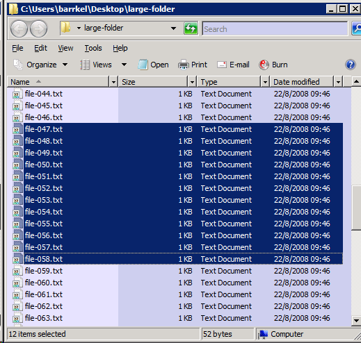
And then delete them, you'll notice that the focus rectangle has disappeared:
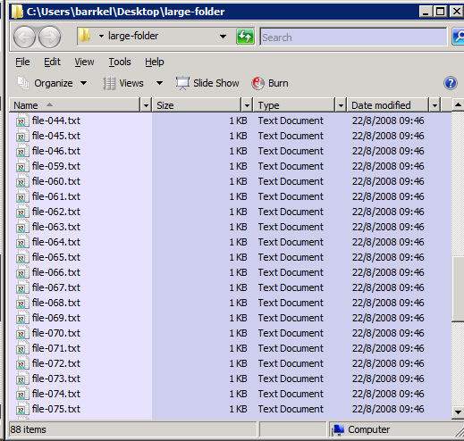
Where did it go? I sure hope I didn't lose my place in that long list of files I was reviewing! Let's see, I press the Up arrow to see if that teases out the focus from hiding, but no luck. I press the Down arrow, and hey presto!
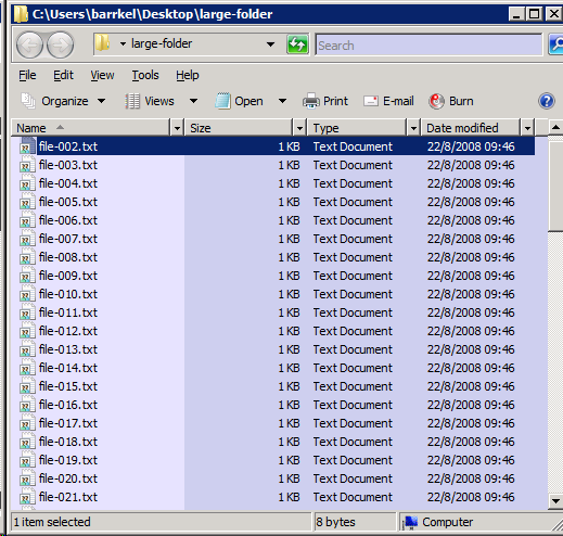
I'm right back at the start. Now I need to scroll through all those files again and pick up where I left off. This does not make me happy.
File system watching maintains sorted order
I often keep a folder open while a background process is creating files in it: anything from an automated build producing log files to a wget mass download job. Now, maybe I'm a really odd fellow, but I rather appreciate the way XP behaves in this scenario: periodically, the kernel notifies Explorer that the underlying directory has changed, and XP will add the new items at the end of the existing listing - even though this may be out of the correct sorting order for the folder. I know that I can just press 'F5' to refresh the view, and everything will be resorted. However, knowing that new files are just appended to the end, I can scroll down there and watch the output appear, and even open it up when I see that the next output file has been created.
In Vista, no longer. Explorer is now "smarter", for some smart-ass value of smarter. Instead, it incorporates new items into the existing sorting order. Now I know some people would consider the old behaviour a bug and the new a fix, but the old behaviour was long-standing, and I had learned to rely on it.
Conclusion
Considering some of the lower-level enhancements in Vista, none of the above items individually would (or should) have been enough to turn me against it. However, when you add it all up, the charge starts getting more serious. I can't use Vista for more than 10 minutes without hitting one or more of these snags (or others that I haven't gone into); and these are just the snags I can't really do anything about.
Other things, like the indexing service, overhead of desktop composition etc., I have all disabled as either inessential or things I already have solutions for.
What I would have liked most is the Vista kernel with an optional selection of Vista applets, combined with an option for selecting the XP shell. In other words, I would have been far happier with a whole lot less. It's not like value for money comes into it: if you have to buy a Microsoft OS to put on a machine you build, the purchase feels more like a tax than it does choice. It was never a matter of a new OS driving me to purchase it, or a new PC.
The product feels oddly like a guilty company's justification for selling a product at a high price but a low marginal cost. It reminds me of government spending; they collect all this money, then have to find ways to spend it, but because of their monopoly position, they don't have the correct incentives, and consequently much of that money would have been better left with its original owner.

13 comments:
You can toggle menu in Media player by pressing Ctrl+M.
Alternatively just press Alt and a menu appears.
Talking about Vista - one thing I hate is creating new folder in Save dialog - if you are fast enough with typing the folder name you end up renaming the last folder while the position of the "New folder" is changed in folder list. Took me a while to figure out what is going on.
I use a product called Directory Opus instead of the normal Windows explorer windows.
It is far superior. Just has a learning curve with it. But once you figure out all of the '/' commands navigation will be a breeze!
I now have it installed on every machine that I own and on my USB Flash Drive. So if I go to someones desk that doesn't have it I just pop that it and run it from there.
Here are some screen shots:
Screen Shot 1
Screen Shot 2
Regards
"constrained tiny little box"
Try this: right-click on start button, choose "Properties".
Tab "Start Menu", press "Customize"
"Number of recent programs to display": set to "99" or something big.
Your start menu should now be *almost* your full screen height.
- Roddy
@shinca - I am aware of Ctrl+M, indeed that is the shortcut shown in the context-style menu itself. The newcomer to the UI, though, has to figure out how to get that far...
@roddy - I don't use recent programs. Instead, I use pinned menu items, so I get to say what goes in there rather than Windows. However, the point still stands: even with lots of shortcuts pinned, I still only have a skinny sliver of the screen in which to navigate the menu, and I still have to click to see each submenu.
@jeremy - The first feature I'd implement in my own shell beyond the basics would be an "async-mode" for file operations. In other words, bulk file operations would appear to complete instantly, but be added to a queue that gets executed in the background. Multiple tasks that access the same physical drive wouldn't be run concurrently, as Windows (and most OSes) suck for concurrent disk access. Tasks could be prioritized, etc.
As for Directory Opus, I have never tried it, but reading its feature list seems to tell me that it won't offer me much. The bash/rxvt console is all the programmable interface I need, including programmable bulk rename support, etc. Meanwhile, I do not trust in-process viewers of disparate media file types. I also have e.g. scripts that use identify from ImageMagick for photo classification, etc. In general, if I find myself doing anything five or six times, I automate it.
Thanks for the hard work of summarizing your snags. I have very similar feelings when working with Vista and yes, it is the sum of these idiosyncrasies that make Vista a very irritating OS. It is beyond my understanding how so much so-called smart people could put together such poor OS. One of the gripes I have is with the shutdown option menu. There is no confirmation dialog, you can easily miss-hit the shutdown method and when hit, my machine stays in limbo land without any visual feedback that shutdown is actually happening for seconds and seconds. I have to watch my hard drive LED to have a confirmation something IS actually happening. We should join forces and write a book about all these wrong engineered Vista idiosyncrasies, bugs & irritating behavior. Maybe, just maybe, Microsoft's arrogance would turn into deep shame.
I bought a laptop to become my main development machine that came with Vista. After 6 weeks of frustrations like the ones you reported here I ripped Vista out and installed Ububntu. I moved my development environment to XP Professional on a VM. I also created a VM with Vista just for testing purposes. (I love this VM stuff)
I'll pass on Vista for my day-to-day environment until Microsoft creates a decent OS. After all I want to be productive;)
Very good job summing things up, though I'm not quite sure about the accelerator underlines. You said they're disabled in WinXP by default, but that hasn't been my experience. I've installed XP on about a dozen different machines, both before and after SP2 rewrote half the OS, and I've never had to enable the underlines. Seeing them disabled in Vista was an absolute shock.
It's tempting to suggest that you just need to get used to these improvements to the IDE <bskp><bskp><bskp>nterface.
;)
@Joylon - if your only purpose on commenting here is to twist every post into a negative comment on the Delphi product, I'm going to start considering you a troll and deleting your comments as they match that pattern.
I don't work on the Delphi IDE. If you want such comments to have constructive effect, or even any effect at all, you should take them somewhere else.
The switch for accelerator underlines (Alt-Key combinations on menu items) is under Control Panel / Ease of Access Center / Make the Keyboard Easier to Use (scroll down) Make it easier to use keyboard shortcuts: Underline keyboard shortcuts and access keys
Anonymous re keyboard accelerators - awesome find. This is one of my biggest complaints about Vista, and likely will be the same against Windows 7 - how so much stuff has been shuffled around and moved, punishing experienced people and providing no benefit.
Treeview draw gaps, Non-configurable Explorer Toolbar, Missing XP-style Start Menu, Missing GUI Navigation in Control Panel, INCONSISTENT EXPLORER / CONTROL PANEL NAVIGATION can all be fixed by Classic Shell (http://classicshell.sourceforge.net/). Missing keyboard accelerator hints can be fixed by going to typing this into Start search: Change how your keyboard works and check Underline keyboard shortcuts and access keys. Inconsistently extended right-click area in detailed listviews can be fixed by turning off full row selection for details view in Windows 7 too (http://www.winhelponline.com/blog/disable-full-row-select-explorer-windows-7/).
File system watching maintains sorted order is unfixable because Vista/Windows 7 are broken OSes.
I am not a developer, so I can't do it myself but I believe the missing security tab for multiple selection can be fixed by modifying a property sheet shell extension which is broken on Vista to just make it initialize and register properly. The shell extension is located here: http://www.codeproject.com/KB/winsdk/accessctrl4.aspx (known as FilePermsBox). It is an exact clone of the Windows Security/permissions tab and works just as well for multiple files (try installing it on XP).
It installs and registers on Windows Vista/7 and the standalone EXE works but the property sheet doesn't work (something I think which is only a matter of changed shell interfaces in Vista to initialize property sheet extensions). I tried contacting that extensions's developer but he seems to have disappeared. Besides, it's an open source license. If you can modify it to just make the property sheet register properly on Vista/7 so that the "Security" tab appears, that would fix this blocking issue.
Post a Comment