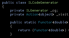
I downloaded and installed VS2010 Beta 1 to see how it's looking. It's not pleasant though - it makes me feel like I'm looking at the screen through a layer of coke-bottle plastic:

Compared to the old rendering, where my preferred fixed-width code / terminal font, Dina, is correctly chosen, as opposed to falling back to what looks like Courier New:

The new rendering hurts my eyes (they keep trying to focus more, but it doesn't help!) and makes VS2010 Beta unusable, as far as I'm concerned.
The "recommended solution" for text clarity issues in WPF is "use the largest font size possible". That's a bit of a cop-out for the working programmer, where displaying as much code on-screen as is comfortably legible is usually the best option.
FWIW, I registered a feedback item on this.
