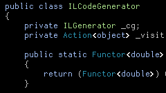
I downloaded and installed VS2010 Beta 1 to see how it's looking. It's not pleasant though - it makes me feel like I'm looking at the screen through a layer of coke-bottle plastic:

Compared to the old rendering, where my preferred fixed-width code / terminal font, Dina, is correctly chosen, as opposed to falling back to what looks like Courier New:

The new rendering hurts my eyes (they keep trying to focus more, but it doesn't help!) and makes VS2010 Beta unusable, as far as I'm concerned.
The "recommended solution" for text clarity issues in WPF is "use the largest font size possible". That's a bit of a cop-out for the working programmer, where displaying as much code on-screen as is comfortably legible is usually the best option.
FWIW, I registered a feedback item on this.

11 comments:
And the menus are DAMN slow, aren't they?
Ouch - Dina hurts my eyes! I favor Consolas ( http://en.wikipedia.org/wiki/Consolas) - needs ClearType though.
To each its own, I guess ;-)
You're both TOTALLY WRONG!!! The ONLY good programming font is Lucida Sans Typewriter, and anybody who disagrees is a total buffoon. (I'd have said "Idiot" or "Moron" but Buffoon is more fun.)
There. The font war is now fully escalated! :)
It certainly doesn't work well with your color choices, does it? It might be better with the more-typical black-on-white, but it's pretty bad with your black background.
To me, though, the problem isn't that the text is blurry in your screenshot -- it's just that it's dark. Is it any better if you pick lighter text colors?
Use Consolas, Monaco
I have similar problems with cleartype and ANY font using a black background.
Clearly the anti-aliasing techniques are designed for a high contrast background, which frankly I find annoying.
Might be time to admit defeat tho.
I dont agree with the code colour problem, I still use Turbo Pascal blue background-style since i dont get used to any other, they totally suck in fact. And like me, there a TON of people still using it, and EVERY time we install Delphi, we HAVE to change it again... Why it was changed to a black-and-white scheme? Who feels comfortable working hours with a brilliant white background?? THAT hurt my eyes! Please, change the Delphi default to a more "classic" view.
I read somewhere that the blurry WPF fonts should be fixed in .net 4.0... let's look...
Yes found it in the comments of:
http://blogs.msdn.com/bharry/archive/2008/11/06/feedback-on-the-vsts-2010-ctp.aspx
Degradation of a product - it is not that thing which is expected by the customers. It seems that Visual Studio team just looses its zeal. A good time for someone to catch up the market :)
This is a well known problem for WPF, since before it shipped. You can google WPF blurry text and see people posting in 2006. Apparently someone thought we'd all have 150dpi monitors by now or something :). Anyways, it'll be fixed in .NET 4 final, and maybe by Beta 2.
I really don't understand why something as simple as font rendering - which we've been doing quite successfully for DECADES now - has suddenly become so complex that it's impossible to get clear text on the screen...
BlurType (tm) [misleadingly referred to as "ClearType" in marketing-weasel-speak] is HORRIBLE. Why on earth would ANYONE want bizarre color fringes on the text they look at all day? Yes, I've tried the BlurType color tuner - I can make the bizarre color fringes different, but no matter what they still appear. And they still look like absolute CRAP.
OK, I understand that VS2010 simply can't display FON fonts any more (though why such a rock-solid technology would be abandoned is completely beyond me), but can't someone build a set of TTF fonts for COURIER and the other popular FON fonts (and no, courier NEW doesn't cut it)?
In case anyone's wondering, the test case is actually quite simple: display a file in VC2008 with COURIER 10 and the same file in VC2010 with your proposed solution. Now, if even 1/3 of a pixel is different, you're not done yet!
Post a Comment